
I've selected the following 10 robot masters from the original 78 based on the series' debut title, Mega Man for the NES in 1987, all the way through to Mega Man 10, released as downloadable content on WiiWare, PSN and XBLA in 2010.
After weeding out the rest, I ranked those that remained according to a three-tier process, beginning with the ones that scored the lowest out of 10 for each category. First, I started with the overall visual design of the character, and then accounted for the complexity of their attack patterns.
Lastly, I throw a coolness factor into the mix based, for the most part, on my first impressions of each because let's face it: if you can't trust your gut, what can you trust?!
Here are the 10 best (and worst) Mega Man Robot Masters!

Blizzard Man
Design: 1/10
Attack Pattern: 3/10
Coolness Factor: 2/10
TOTAL: 6/30
A bulging torso with shoulder pads... on skis? And don't even get me started on the hat and gloves. I can understand the winter theme, but they don't match anything else in the design and the color choice is just off-putting and borderline gross. Oh, and not to mention those eyes peeking out at you is a little disturbing.
You would think that by Mega Man 6, Capcom would have aspired to something a little more becoming for the AI, but nope. Blizzard Man sloshes toward you on those terrifying skies ready for battle. If you thought that was bad, then get a load of this; all he does is toss a few snowflakes at you. Yeah, that's his attack -- I bet you're intimidated, aren't you?
Blizzard Man is a confusing amalgamation of a robot master that was originally designed as a weather monitor. This guy has so little going for him, I'm surprised he's not a manic depressive and with a total score of 6, he's really scraping the bottom of the barrel.
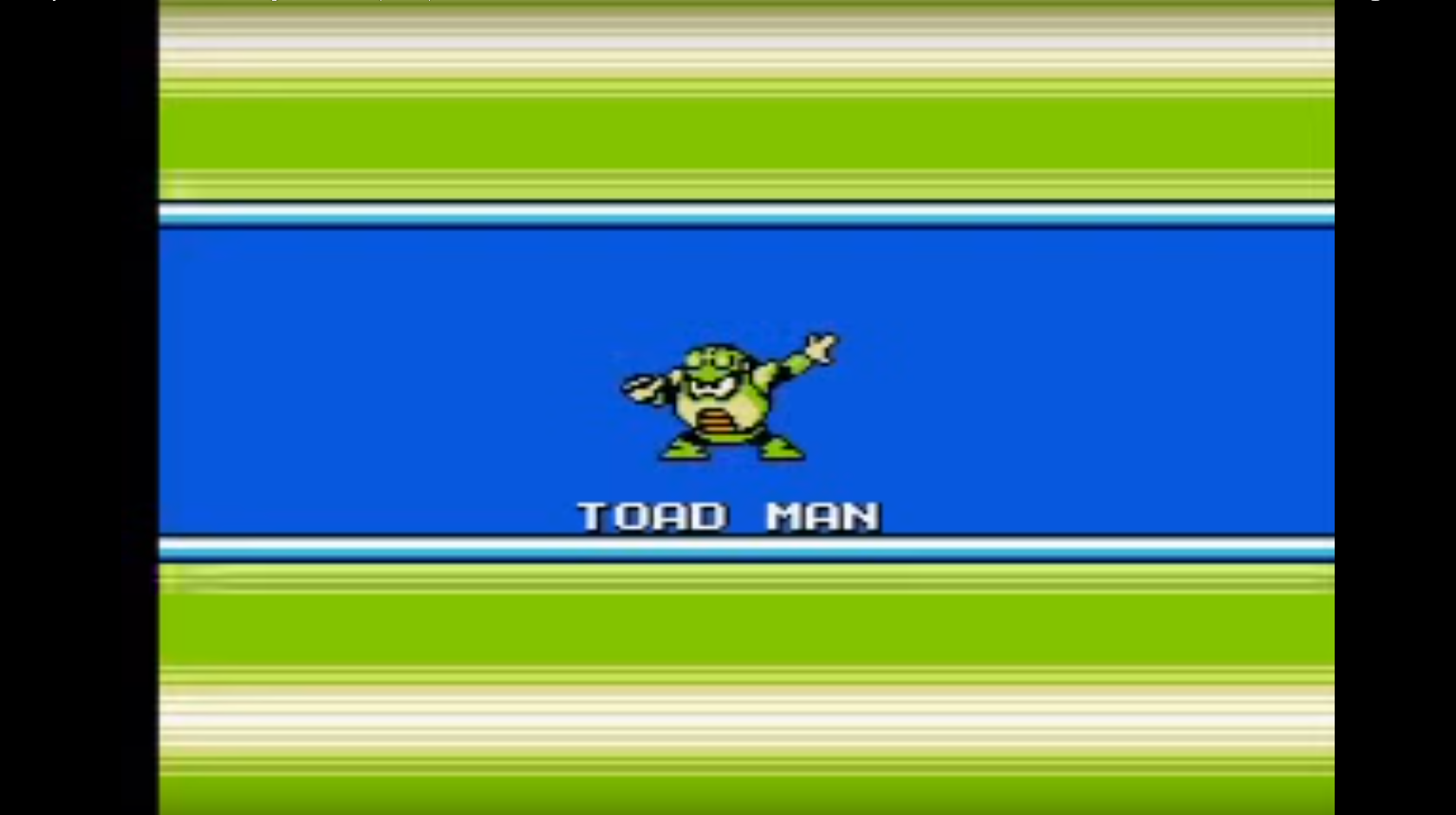
Toad Man
Design: 4/10
Attack Pattern: 1/10
Coolness Factor: 3/10
TOTAL: 8/30
Ironically enough, this guy doesn't look all that much like a toad. Nevertheless, he gets points for effort. The bulky, humanoid design and that mean glare afford him a bit of credit but that's as far as it goes. The random striations at his midsection and the flat coloring don't really contribute a whole lot the overall effect.
Toad Man is much less imaginative than I would have expected. I know he's supposed to be a toad but let's be real, Capcom, you're working within the boundaries of fiction here, fantasy. Give him something a little more substantial than clumsily jumping toward you at a moderate rate.
Alright -- I'm not sure if I'm alone on this so bare with me -- but doesn't Toad Man share a striking resemblance to Guldo, from DBZ's Frieza Saga? These two look so similar, that he might as well go out and join the Ginyu Force; no one would ever know the difference. This tiny detail is really the only reason that Toad Man got a 3 in this last category, bringing him to a grand total of 8...wow.
Dust Man
Design: 3/10
Attack Pattern: 5/10
Coolness Factor: 1/10
TOTAL: 9/30
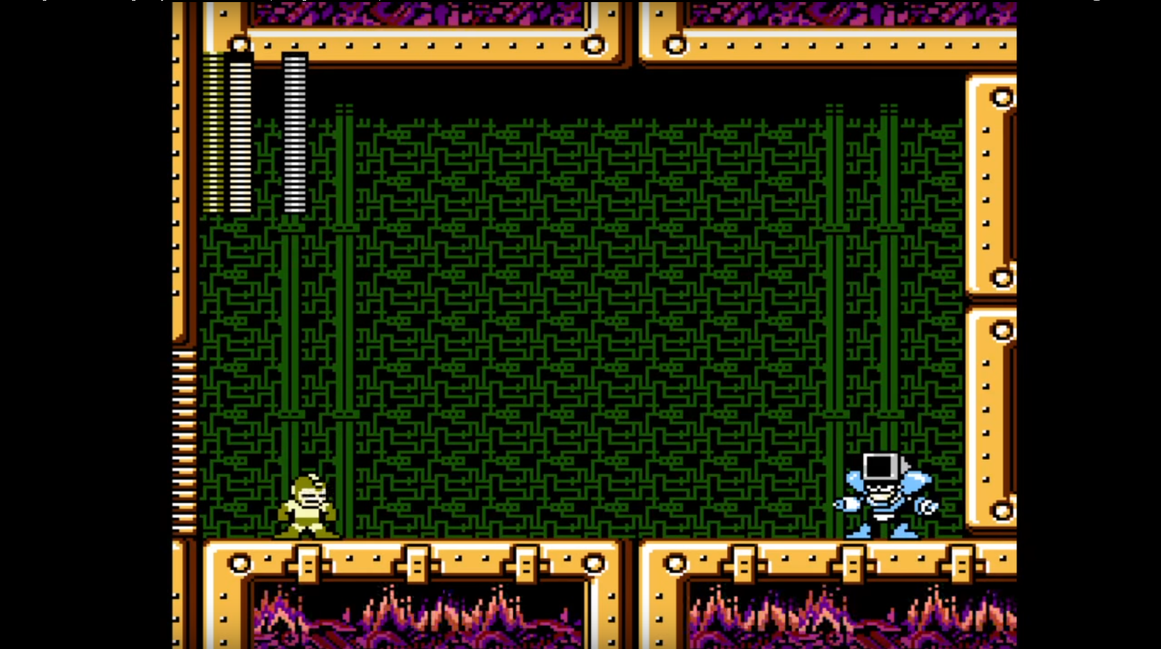
A sleek, armored look gives Dust Man an edge over some of the others; however, that confused, uninterested facial expression and the lazy box-shaped design knocks him back down a few notches.
His attack pattern is: Inhale, jump, shoot. Simple enough -- and that's why he gets a 5. I'm not 100% certain what it is that Dust Man throws at you, but he seems more closely related to Junk Man that anything.
This master is just a DirtDevil vacuum granted sentience by a madman bent on world domination. That one image is enough to give Dust Man a low score on principle alone. Fortunately, that isn't what's going on here because the developers took care of that for me. After all, they could have turned him into a stick with bristles attached to the end and called him Broom Man and the question we'd have to ask ourselves is: Would it really change anything?
Napalm Man
Design: 2/10
Attack Pattern: 6/10
Coolness Factor: 4/10
TOTAL: 12/30
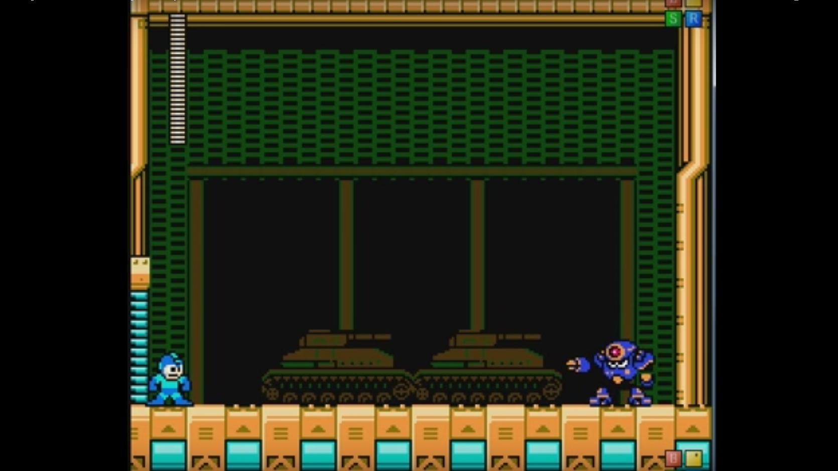
The overall design of Napalm Man feels more than a bit lacklustre, to say the least. The deep purple of his torso makes me think of a sweet rare drop I'd get from Torchlight rather than a hulking machine that's ready to blast me into next week.
Even though his weapon may look run-of-the-mill, its purpose is twofold, allowing him to either shoot missiles or toss the projectiles like grenades. Napalm Man jumps and tosses his explosives in a variety of both wide and narrow arches and the grenades actually have a pretty decent blast radius.
I'm not really sure what this thing is supposed to be. A wannabe tank with limbs? With those treads and the dome-shaped head, he looks more out of place in a Mega Man game than he would let's say, taking part in a roller derby.

Sheep Man
Design: 5/10
Attack Pattern: 7/10
Coolness Factor: 5/10
TOTAL: 17/30
It's a sheep, true, but I've got to give credit where it's due because at least Sheep Man looks more or less like a sheep. Sort of. Well, he's a lot closer than many of the others anyway, and he doesn't look half bad. The horns and that glare only prove that this guy means business.
Firing bouncing balls of electricity and the fact that he can turn into clouds quite frequently make him a contender against the player. Said clouds proceed to discharge bolts of lighting and have an almost impressive rate of fire, which gives you a fair bit to account for and dodge. Sheep Man may not have the best programmed AI but it is among some of the better ones.
The attempt is solid because it's not often that you run into a sheep with a nasty attitude; especially one that can give you a run for your money. At the end of the day, though, he's still just a ball of fluff with conductors poking out of his back.
Heat Man
Design: 6/10
Attack Pattern: 4/10
Coolness Factor: 9/10
TOTAL:19/30
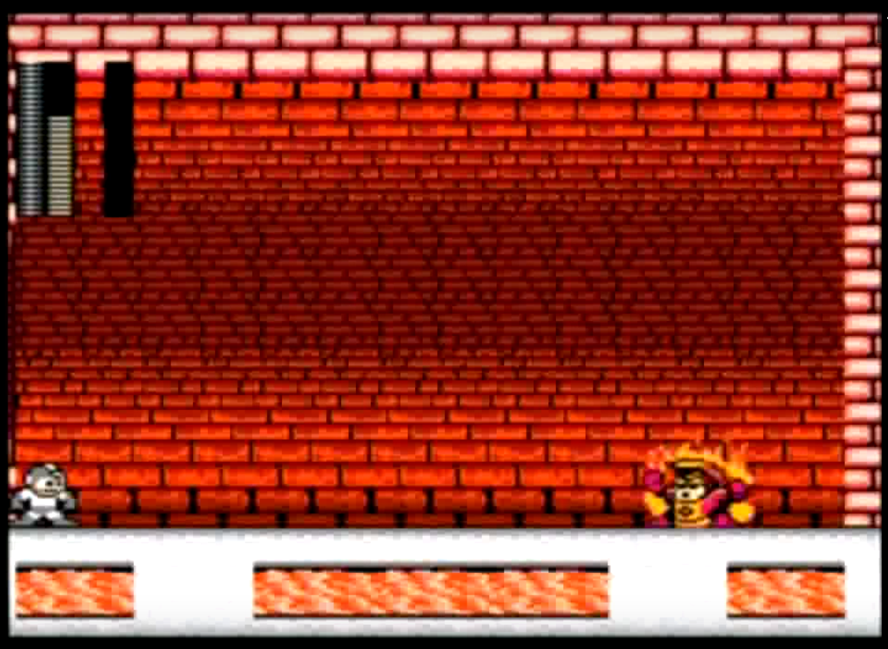
This is one of those rare moments when you can actually tell what a robot master is based on; and in this case that would be a zippo lighter. He's simple, has a streamlined shape and the use of warm colours is nice, with the slick red and contrasting yellow.
Unfortunately, as much as I like his design the battle was somewhat of a letdown. He doesn't do a whole lot, except Flame On and charge toward you rather sluggishly -- or shoot a few fireballs at you with the same lethargic attitude. The laziness in his eyes seems to reflect his neglected AI and in a big way can be traced back to the developers. Working on Heat Man must have been a Friday job while everyone was rushing to get out of the office.
I had to give Heat Man top marks here because well, look at him. He's like the Human Torch if he were bored to tears and having a really bad day. Having all that power and being completely indifferent -- that makes him alright in my book. Just don't try to light your cigarettes with him. A 12,000 degree zippo is a bit of an overkill.

Pharaoh Man
Design: 8/10
Attack Pattern: 2/10
Coolness Factor: 10/10
TOTAL: 20/30
The design of Pharoah Man has to be one of my favorite, even though he appears to be somewhat bland at a glance. It's a sturdy build indicative of an armored warrior. The black and yellow -- two of the six traditional Egyptian colors -- are topped of by the fact that he's even wearing a Nemes Crown, just in case you didn't know who was in charge.
It's a shame that I had to give Pharaoh Man such a low score for the paltry offerings of his attack. The extent of his abilities appears limited to jumping at a wide angle and slowly firing an energy wave in your direction, which I have to say, is not altogether impressive. It's a good thing he makes up for it in other areas.
You have to admit, this guy is a boss. Look at him, Pharaoh Man isn't messing around -- even his 8-bit sprite demands respect. If you don't believe me then watch this. Anyone who can sucker-punch the Blue Bomber is alright with me.
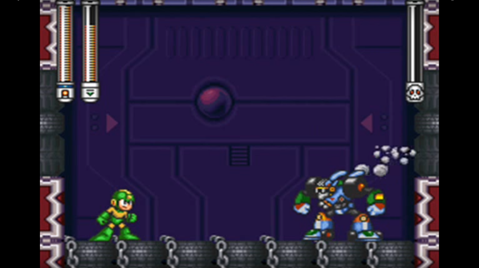
Turbo Man
Design: 7/10
Attack Pattern: 9/10
Coolness Factor: 6/10
TOTAL: 22/30
First of all, Turbo Man is basically a Transformer and if that isn't a good start, then I don't know what is. If he was a black and yellow striped Camaro, I'd call him Bumblebee and be done with it but sadly, that isn't the case. On the downside, however, there are a lot of flashy colors, some of which feel unnecessary and out of place.
Turbo Man transforms into his vehicle mode quite often and rushes you, then proceeds to jump up in the air and encase himself in a ring of fire. That's not all -- he then throws it at you where it has a few seconds of hang time before bouncing and dispersing over the arena. If you're not used to it, Turbo Man here might prove to be a slight nuisance and it may take a few attempts before being able to best him.
Turbo Man is one of those guys who's cool and he knows it -- and with those shades he's just oozing '90s style. If that's not enough to convince you, just watch how he stares down Mega Man; he's not the least bit worried.

Shade Man
Design: 9/10
Attack Pattern: 8/10
Coolness Factor: 7/10
TOTAL: 24/30
Shade Man's design seems to be somewhat dark and edgy. The sharp lines, deep colours and the tall collar give him a nice, respectable look, don't you think? Oh, and given the whole robot situation, the wings come off as essentially useless, but I'll be damned if they don't look good.
I remember Shade Man being a bit difficult when I fought him, mainly because he kept grabbing me. His constant tackling kept interrupting the timing necessary to avoid the attack. That, combined with his sonic blasts and the fact that he spends most of his time hovering in the air, keep him on the tougher end of the spectrum.
Look at that tail, those ears, the impressive wingspan. A mechanized vampire with a sonic blaster for a hand, who drinks the oil out of other robots in order to heal himself. How can you get any better than that?
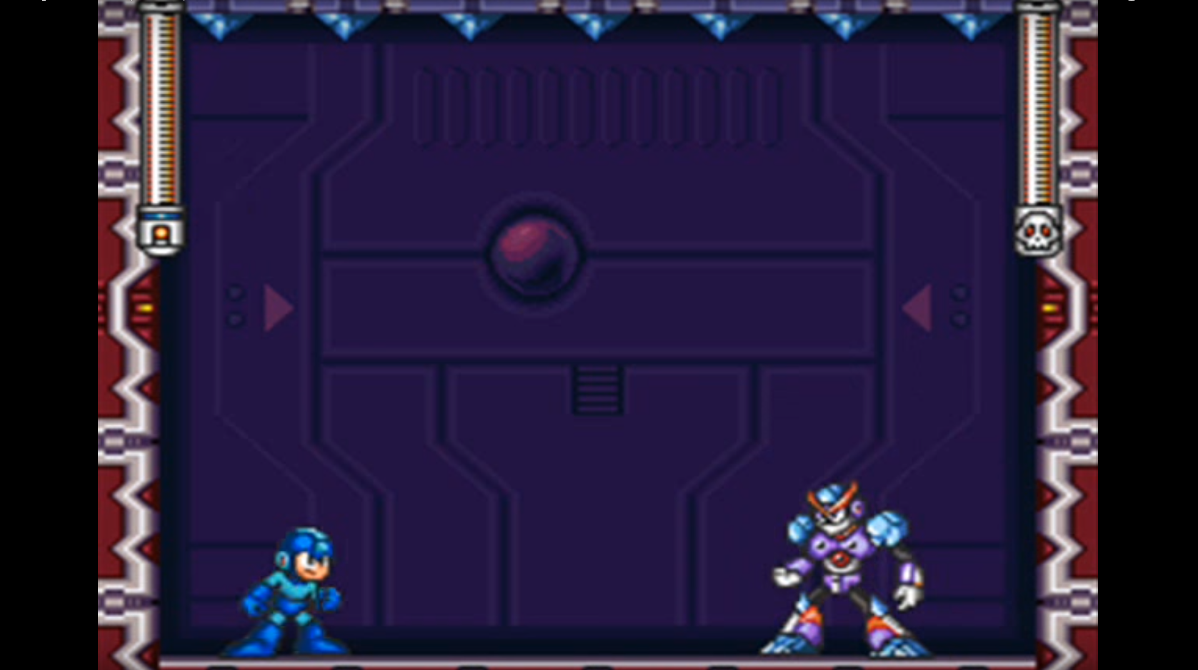
Freeze Man
Design: 10/10
Attack Pattern: 10/10
Coolness Factor: 8/10
TOTAL: 28/30
This is how. Smooth and tapered, Freeze Man has a strong upper body and large feet to keep him grounded. The blue is an added bonus as well because aside from being my favorite colour, it goes well with the purple and the slim segmented design.
Quick on his feet, Freeze Man has a number tricks up his sleeve in case you start acting up and get out of hand by, you know, fighting back. An ice blast is his primary weapon that he uses in numerous ways. In addition to firing it directly at you, he also directs it at the roof to form several stalactites, that rapidly descend in an attempt to damage you. He also coats the floor in a sheet of ice to make you slip all over and falter when trying to make a move.
Bulging deltoids made of ice? Just try to convince me that this guy doesn't lift, I dare you! The furrowed brow and strong body language tell the whole story. His bold stance is a strong indicator that Freeze Man is ready for a fight at any time and more than confident that he can succeed.

There we have it. The top 10 best and worst Mega Man robot masters of the original series. They all have their own merits and pitfalls and there were many to choose from, but there can only be one winner. This time around, Freeze Man secured that position of honour among his robotic brethren.
Do you have your own pick for the top spot? Let me know what it is in the comments below. Let's kick off a lively discussion about Capcom's Blue Bomber and see who comes out on top against a wider fan base!



Published: Dec 1, 2016 06:12 am